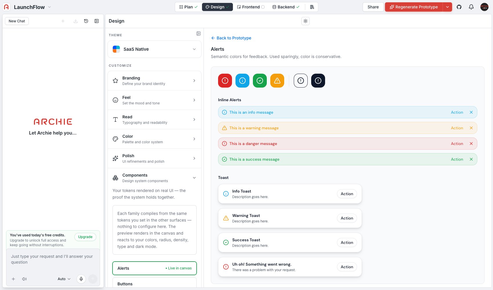
Your design values rendered on real UI — a live gallery that proves your design system holds together.
Components is a live gallery, not a form. Every family here compiles from the same values you set in Theme, Branding, Feel, Read, Color, and Polish — there is nothing to configure directly on this page. It exists to show you those values working together on real UI before you commit to them.
Alerts — semantic feedback colors, used sparingly and conservatively
Buttons
Forms
Cards
Pills & badges
The preview renders in the canvas and reacts live to your colors, radius, density, type, and dark mode — change a value anywhere else in Design and come back here to see how it lands on real components.
Treat Components as a checkpoint, not a starting point. Set your theme and design values first, then open Components to catch anything that looks off — a shadow that reads too heavy on a card, a corner radius that clashes with a pill badge — before you look at full generated screens in Screens.
No. Components is a preview surface for the values set elsewhere in Design. To change how a button or card looks, adjust Color or Polish and return here to check the result.